
You open your scheduler to line up a week of posts. One tab shows your draft. Another has image sizes. A third has platform rules you forgot again. You click into the calendar, back to captions, into upload, back to previews, then get stopped by an error you only see after submit. Ten minutes later, one post is scheduled and your focus is gone.
That's the moment someone calls a tool “clunky.” In UX, I'd call it something more precise. The interface is adding friction to a job that should feel routine.
For creators and marketers, that friction isn't cosmetic. It affects whether you publish consistently, whether your team adopts the tool, and whether visitors trust your product enough to stay. Research compiled from established UX sources reports that 88% of users say they won't return after a bad experience, and that every $1 invested in UX can return about $100 according to the roundup at Colorlib's UX statistics page. Those numbers are why interface decisions belong in the same conversation as retention and conversion.
A user friendly interface also matters after the click. If someone is trying to review comments, schedule a carousel, or compare content performance, they don't want to think about the software. They want to think about the work. That's the standard worth designing for.
If you work in content, audience growth, or social workflows, this matters even more because your day already has enough moving parts. The less energy you spend decoding a dashboard, the more energy you can spend on message, timing, and audience engagement.
Table of Contents
- Introduction Why Friendliness Decides If People Stay
- What a User Friendly Interface Really Means
- Core UX Principles That Make Interfaces Feel Effortless
- Design Patterns and Real World Examples That Work
- Platform Specific Notes for Social Media Tools Like SleekPost
- How to Measure Usability With Checklists and Testing
- Common Pitfalls Quick Wins and Your Next Steps
Introduction Why Friendliness Decides If People Stay
You open a scheduling tool to queue five posts before lunch. The copy is ready. The images are exported. Then the interface starts making small demands. The publish button changes location between screens. A platform warning appears only after you submit. The calendar view hides whether the post is a draft or scheduled. What should feel like filing a document starts feeling like assembling furniture without instructions.
That moment shapes whether people stay.
A user friendly interface is not a style choice. It is a performance choice. People call a product friendly when they can complete a task with little hesitation, recover from mistakes, and read what the screen is asking of them on the first pass. In a social workflow, that means fewer scheduling errors, less second-guessing, and more confidence that a post will go out the way you intended.
A “friendly” interface gets confused with a “minimal” one all the time. A sparse screen can still be hard to use if labels are vague, controls are hidden, or important limits show up too late. A better test is simple. Can someone schedule content, check approvals, and confirm timing accurately without creating their own workaround?
Why this affects business decisions
Usability shows up in behavior before it shows up in a design review. Teams hesitate. Drafts sit longer than they should. People keep private checklists because they do not trust the interface to catch mistakes. In tools like SleekPost, where the job is often tied to timing, channel rules, and audience engagement strategy, each extra doubt slows down the work.
Friendliness is measurable, too. You can look at task completion, error rates, time on task, and post-test scores such as SUS. If people need several tries to schedule one carousel correctly, the issue is not taste. If users with different vision, motor, or reading needs struggle to interpret the same screen, the issue is not taste either. It is legibility.
That shift matters. It moves the conversation away from “Does this UI look clean?” and toward “Can different people use it correctly under normal working pressure?”
What people usually get wrong
Creators and marketers often inherit a visual definition of usability. White space equals easy. Fewer visible controls equals modern. In practice, friendliness works more like a well-marked transit system. A station can look beautiful and still fail if signs are unclear, routes are hard to compare, or one wrong turn forces you to start over.
Interfaces work the same way. The friendly ones reduce avoidable errors, explain choices at the right moment, and stay readable for a wide range of users. That includes people skimming between meetings, people using a keyboard, people on small screens, and people returning to a task after an interruption.
So the standard is higher than visual polish. A friendly interface helps people finish real tasks accurately, and helps more of them do it without strain. That is the definition worth using if you want retention, trust, and steady adoption.
What a User Friendly Interface Really Means
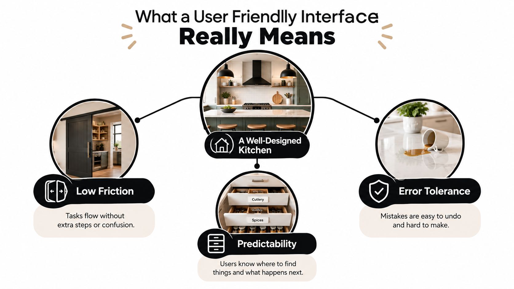
A user friendly interface works like a prep station during a busy lunch rush. The knife, board, and ingredients are easy to reach. Labels are clear. If someone grabs the wrong container, they can correct it fast without starting the dish over.
That is a better standard than "clean-looking."
In interface design, friendliness means people can complete a real task correctly, with reasonable speed, and without confusion. For a social media workflow, that might mean drafting a post, adjusting copy per platform, checking the preview, and scheduling it in SleekPost without wondering whether it saved. The screen does not need to feel minimal. It needs to feel legible and dependable.
The three signals users notice first
People usually describe a product as easy when three conditions are present:
- Low friction: The next step is obvious, and the task does not ask for duplicate effort.
- Predictability: Labels, buttons, and layouts behave consistently from screen to screen.
- Recovery: Mistakes are easy to spot and easy to fix before they become costly.
These are not style preferences. They are task conditions.
If a creator uploads the wrong image and can swap it without losing captions, that is recovery. If a marketer can tell whether a post is scheduled, queued, or failed from one glance at the calendar, that is predictability. If each network's requirements appear at the moment they matter, instead of being buried in a settings panel, that is low friction.
Why the idea changed over time
Friendly interfaces became the standard as software shifted from command-heavy systems to visual systems people could learn by recognition. A useful historical marker is the GUI timeline. Xerox introduced the Star in June 1981 with double-clickable icons, overlapping windows, dialog boxes, and a 1024×768 monochrome display. Apple followed with the Macintosh in January 1984, bringing graphical interaction to a much wider audience, as summarized in this GUI history timeline.
That shift changed the job of interface design. Instead of asking users to remember commands, designers had to make actions visible, labels understandable, and system state easy to read.
Usability also became something teams could measure. Analysts at Nielsen Norman Group found that success and failure rates can be benchmarked across repeated studies over time, which is why teams now track completion rates, errors, and post-test scores such as SUS rather than relying on visual opinion alone.
Friendly is not the same as sparse
A stripped-down screen can still be hard to use. If the publish button is vague, the status message is easy to miss, or icon-only controls force guesswork, the interface looks tidy while task success drops.
A friendlier design leaves enough clues for people to act with confidence. That matters for users on small screens, keyboard users, people skimming between meetings, and people returning after an interruption. Accessibility supports friendliness here because readable contrast, clear focus states, and plain labels reduce mistakes for everyone, not only for users with formal accessibility needs.
If you want another practical perspective on screens where space is tight, this mobile app UI design guide is useful because mobile layouts expose weak hierarchy and weak affordance fast.
A user friendly interface helps more people complete the job correctly, with less strain and fewer errors.
Core UX Principles That Make Interfaces Feel Effortless
People often describe a strong product by saying it “just makes sense.” Usually that feeling comes from a small set of principles working together. Not magic. Structure.
Consistency and visibility
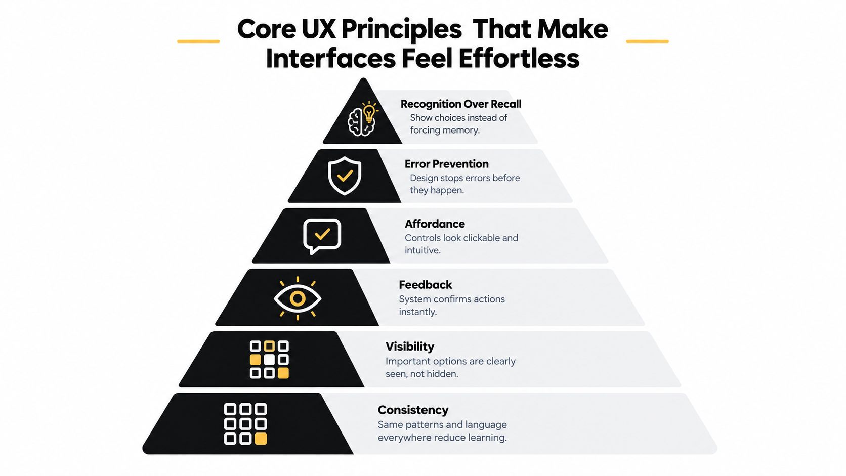
Consistency means the product uses the same patterns for the same kind of action. If “Schedule” is a primary button on one screen, don't hide it inside a dropdown somewhere else. If account switching appears in the top right, keep it there.
Visibility means important options are present when users need them. A publishing workflow shouldn't make users hunt for platform previews, media rules, or post status. If those details matter to task success, surface them.
These principles reduce cognitive load because users stop re-learning the interface every few clicks. For teams working across third-party tools, consistency also lowers the cost of switching between systems.
Feedback and affordance
A friendly interface speaks back. Not with chatter, but with clear status.
When a user uploads a video, the screen should show progress. When a post is queued, the calendar should confirm it. When something fails, the error should explain what happened and what to do next.
Affordance is related but different. It means controls should look usable. A button should look clickable. A drag area should look droppable. A field that supports tagging shouldn't look like plain text.
For a broader practical read, this summary of core UX principles is helpful because it translates these ideas into interface decisions teams can review together.
Here's a quick visual explainer before we go deeper:
Error prevention and recognition over recall
These two principles save more time than flashy redesigns.
Error prevention means the interface stops common mistakes before they happen. If a user tries to post an unsupported file type, tell them before final submission. If a caption is too long for one platform, flag it while they type. If a scheduled time conflicts with a setting, reveal that immediately.
Recognition over recall means the screen shows choices instead of forcing memory. Don't make people remember image specs, account states, or previous selections if the product can display them.
Nielsen Norman Group's iterative design example shows why this matters. Across successive versions, errors per user dropped from 4.3 to 1.5 and catastrophes per user dropped from 1.00 to 0.17 in their iterative design study. The same study notes that even small error-rate changes affect usability, and cites roughly one error per 170 tasks as a very low measured rate for one version.
In high-frequency workflows, those small reductions compound. If someone schedules content daily, every avoided mistake pays back over and over.
A quick audit lens
Use these prompts on any screen:
- Can users predict the next step?
- Can they see the key action without searching?
- Does the interface confirm action clearly?
- Does it prevent common mistakes early?
- Does it show information users would otherwise have to remember?
If a screen misses several of those, it may still look polished. It just won't feel effortless.
Design Patterns and Real World Examples That Work
Principles are useful, but patterns are what people ship. When a team says, “We need this screen to feel easier,” they usually need better pattern choices, not another abstract UX workshop.
Patterns that reduce friction
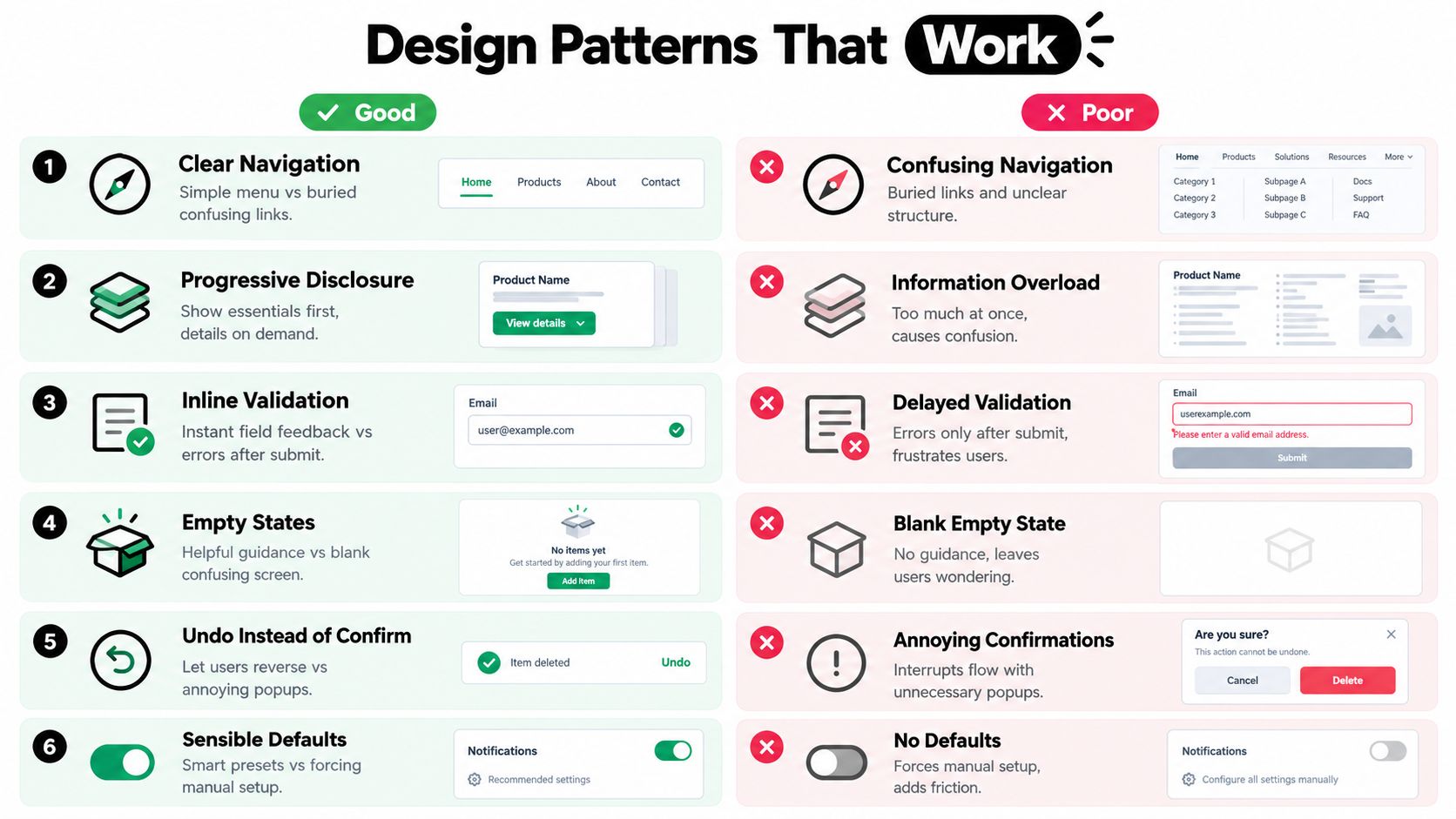
A few patterns consistently help social, content, and dashboard products:
- Clear navigation: Put planning, drafts, scheduled posts, and analytics in places that match user goals.
- Progressive disclosure: Show the essentials first, then reveal advanced options when they're needed.
- Inline validation: Tell users about caption limits, missing fields, or media problems before submit.
- Helpful empty states: A blank calendar should teach. It shouldn't just sit there.
- Undo instead of over-confirming: Let users reverse low-risk actions instead of asking “Are you sure?” every time.
- Sensible defaults: Pre-fill repeatable settings when the product already knows the likely choice.
One place this becomes visible is in asset handling. If your workflow involves media uploads, preview quality, and publishing delays, your upload flow has to guide users rather than surprise them. This is especially true when dealing with large file uploads, where progress, file-state visibility, and recoverability matter as much as visual style.
Friendly vs Unfriendly Pattern Choices
| Design Decision | Friendly Approach | Unfriendly Approach |
|---|---|---|
| Clear Navigation | Groups tasks by user intent such as Drafts, Queue, Calendar, Published | Mixes account settings, content actions, and reporting into one menu |
| Progressive Disclosure | Shows core posting fields first, then advanced options on demand | Displays every setting at once |
| Inline Validation | Flags errors while typing or uploading | Waits until final submit to reveal problems |
| Empty States | Explains what to do next with examples or starter actions | Shows a blank page with no guidance |
| Undo Instead of Confirm | Lets users reverse accidental actions quickly | Interrupts every action with confirmation popups |
| Sensible Defaults | Remembers recurring choices like posting profiles or timing preferences | Forces repetitive setup each time |
A simple before-and-after contrast
Think about two caption editors.
The first one gives you one text box, no preview, and a generic “invalid input” message after submit. The second shows per-platform preview, warns when text exceeds a limit, and keeps your draft intact when you edit media. The second editor doesn't just look better. It protects momentum.
Design test: If the safer, clearer version feels slightly more obvious, that's usually a good sign.
Another common example is the empty calendar. A weak version shows a blank grid. A stronger version gives sample states, a primary action, and guidance about what “scheduled,” “queued,” and “published” mean. New users don't need less interface. They need more usable signals.
The practical lesson is simple. A user friendly interface is often built from ordinary patterns chosen carefully and repeated consistently. Most products don't need novelty. They need fewer avoidable interruptions.
Platform Specific Notes for Social Media Tools Like SleekPost
Social tools add a wrinkle that many general UX articles ignore. The task isn't just “post content.” It's “adapt one piece of content to several platforms, each with different formats, tone, and media rules, without losing speed.”
That means friendliness in a social dashboard depends heavily on how well the interface manages context switching.
What social workflows need most
A strong social interface should support four realities at once:
- One source, many outputs: You may start with one post idea, but LinkedIn, X, Instagram, and Threads often need different copy or media.
- Fast iteration: Marketers revise often. The UI can't punish changes.
- Preview confidence: Users need to know what will appear where before publishing.
- Low switching cost: The dashboard should keep related decisions in one place.
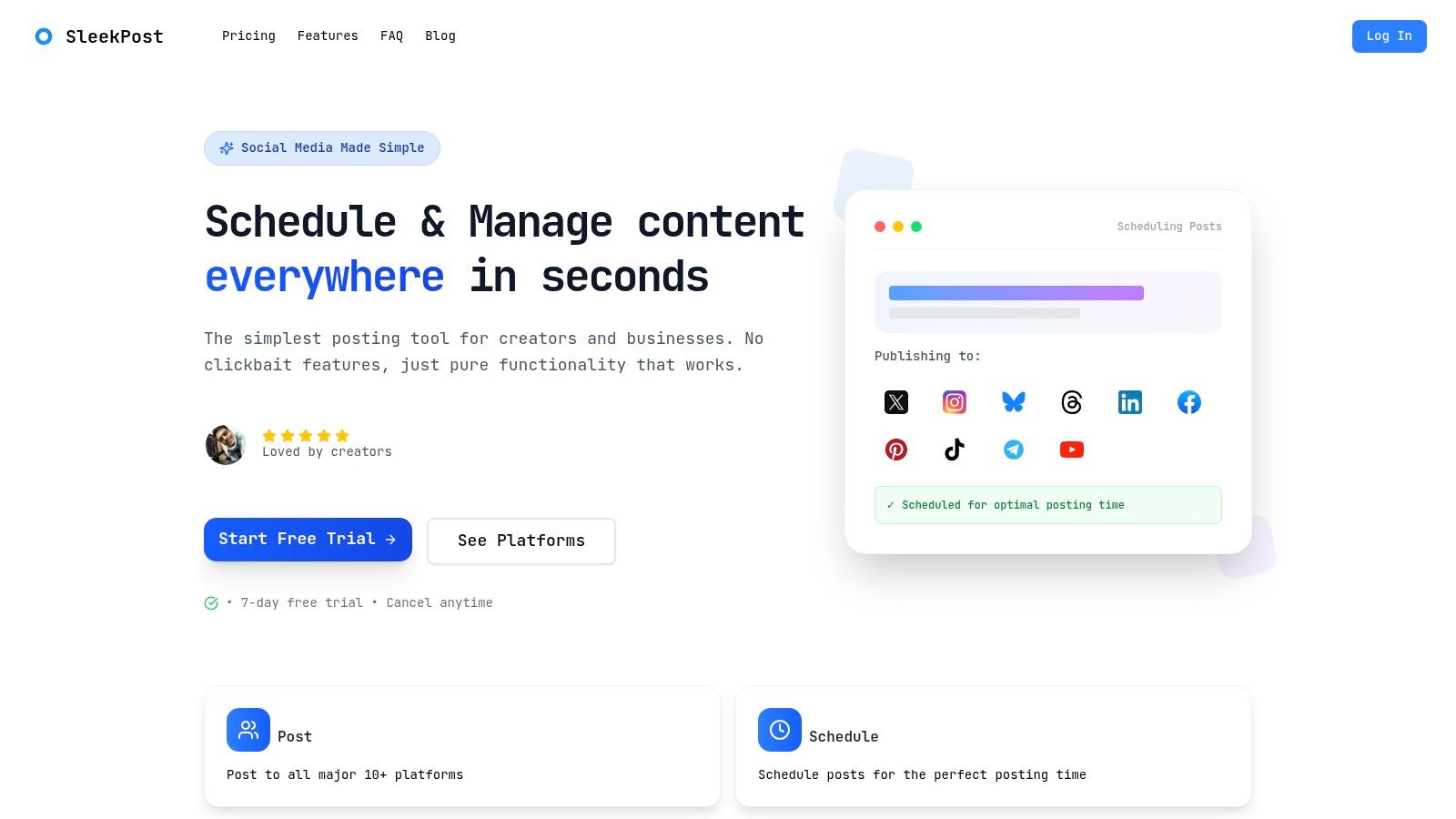
A product like SleekPost fits naturally into the conversation. It offers a single dashboard for scheduling and publishing across multiple platforms, with per-platform copy and media customization, queueing, recurring posts, and AI-assisted drafting. Those are interface decisions as much as feature decisions because they remove repeated jumps between separate tools and mental checklists. If you're comparing options in this category, a social media scheduler app should be judged on how well it supports that full workflow, not just on whether it has a calendar view.
Where AI helps and where it can hurt
AI can reduce effort when it speeds up repetitive work such as first-draft captioning, repurposing a link into different platform formats, or batching variants.
But AI can also make a user friendly interface less friendly when it adds hidden complexity. Users get frustrated when outputs appear without context, when editing the generated result is awkward, or when the system adds extra confirmation loops.
Current UX commentary increasingly treats responsiveness as part of usability, and independent reporting on AI-generated design found that when accessibility was not explicitly requested, interactive elements could be undersized, with buttons ranging roughly from 24 to 32 pixels in the UX Tigers review. That's a useful reminder. Automation doesn't excuse basic usability.
A better way to think about platform customization
Creators often ask whether customization should happen on one screen or many. My answer is usually this: keep the shared content model visible, then let people branch into platform-specific changes without feeling like they've left the task.
That's also why adjacent specialized tools can be useful in certain flows. For example, if LinkedIn is a major channel for your brand voice, a dedicated LinkedIn content creation tool can help generate raw material. The interface still needs to make review, editing, and scheduling easy once that draft enters your publishing workflow.
Friendliness in social software means preserving momentum across channels, not just making one screen look calm.
How to Measure Usability With Checklists and Testing
They don't need a lab to evaluate usability. They need a repeatable way to see where people slow down, where they make mistakes, and where the interface asks for too much memory.
A good audit starts with real tasks. Not opinions.
A practical checklist you can run this week
Pick three common workflows, such as scheduling a post, customizing it by platform, and correcting a media error. Then review each flow against this checklist:
- Task clarity: Can a new user tell what to do first?
- Action visibility: Is the main action obvious on each step?
- System feedback: Does the interface confirm progress, save state, and completion?
- Error handling: Are mistakes explained clearly, with a useful next step?
- Recovery: Can users undo, edit, or retry without starting over?
- Accessibility basics: Can someone use the flow with keyboard navigation, clear labels, and readable contrast?
- Reporting legibility: If the task ends in results review, are metrics grouped in a way that supports decisions rather than forcing interpretation?
That last point matters more than many teams expect. If your workflow ends with dashboards or performance summaries, reporting best practices become part of usability too.
Using SUS without overcomplicating it
The System Usability Scale, or SUS, is useful because it turns user perception into a comparable score. It uses a normalized 0 to 100 scale. Multiple usability sources identify 68 as the population-average SUS score, with scores above 80 typically considered top-tier and scores below 68 below average, as explained in this SUS guide.
That gives teams a simple benchmark:
- Below 68: Your product is underperforming relative to the broader product population.
- Around 68: Usability is average, which is not the same as good.
- Above 80: Users are generally experiencing strong usability.
SUS is also described there as technology-agnostic, which is why it works for websites, apps, and internal tools alike.
What to measure during testing
You don't need large numbers to learn. You do need the right observations.
Track:
- Task success: Did the person complete the task?
- Time on task: Where did they pause, hesitate, or backtrack?
- Errors: What went wrong, and was recovery easy?
- Confidence: Did they feel sure, or did they proceed cautiously?
The most useful usability metric is often the exact step where confidence drops.
If you need to prioritize fixes, start with anything that blocks task completion, causes repeated errors, or creates fragile workarounds. Pretty annoyances can wait. Workflow breaks can't.
Common Pitfalls Quick Wins and Your Next Steps
The biggest mistake I see is confusing “less visible” with “more usable.” A clean interface can become hostile the moment it hides actions, removes labels, lowers contrast, or traps keyboard users in parts of the screen they can't exit easily.
Accessibility guidance is a helpful corrective here. Public-sector and accessibility research emphasizes that interfaces need to work for people using screen readers, keyboards only, voice input, and low-bandwidth or low-skill contexts. The same accessibility summary notes that the median Lighthouse Accessibility score improved only slightly to over 85% in 2025, which still leaves room for improvement across the web, according to Enalyzer's accessibility article.
Pitfalls that quietly make interfaces harder
Watch for these:
- Hidden controls: Users can't act on what they can't find.
- Weak affordances: Text links that look like labels, buttons that look disabled, or cards that seem clickable but aren't.
- Low-clarity errors: Generic warnings that say something failed without explaining why.
- Over-minimal forms: Too few labels, too much placeholder text, not enough guidance.
- Keyboard traps and focus issues: People can't move reliably through the interface without a mouse.
Quick wins with outsized value
Teams can improve friendliness quickly by doing a few ordinary things well.
- Label actions plainly: “Schedule post” beats vague phrasing.
- Keep previews close to editing: Users shouldn't guess how content will render.
- Show state clearly: Draft, queued, failed, and published should never blur together.
- Prefer undo over interruption: Let people recover instead of confirming every action.
- Design for legibility first: Clear labels, contrast, structure, and input support help more users than aesthetic trimming ever will.
The broader lesson is simple. A user friendly interface isn't the one with the fewest elements. It's the one that helps the widest range of people complete important tasks with the least unnecessary effort.
If you're improving a social workflow, start with one recurring job. Scheduling. Editing by platform. Reviewing results. Audit that flow for friction, error risk, and accessibility gaps. Then fix what breaks confidence first.
If you want a lightweight example of this approach in practice, SleekPost offers a clean social publishing dashboard built around scheduling, per-platform customization, queueing, recurring posts, and AI-assisted drafting without stuffing the workflow with unnecessary steps. Visit it and review the product through the lens from this guide: task success, clear feedback, and legibility for real day-to-day publishing work.